
Today, when we imagine a pink house, our thoughts almost inevitably turn to Barbie. Others may think of Hello Kitty, little girls’ bedrooms or an explicitly feminine imaginary. It is an association that feels natural to us. And yet, long before it became the colour of a doll, pink was already one of the colours of our built environment. For centuries, pink had nothing to do with gender. In fact, it was one of the most common colours in architecture.
The reason was not aesthetic. It was economic.
Many of the pinkish shades that still characterise cities and villages across the Mediterranean did not result from an independent colour choice, but from the materials that were available: lime, local sands, cocciopesto made by grinding bricks, stone powders and natural earth pigments. Colour was the consequence of matter, not fashion, and helped create landscapes deeply rooted in their surroundings.
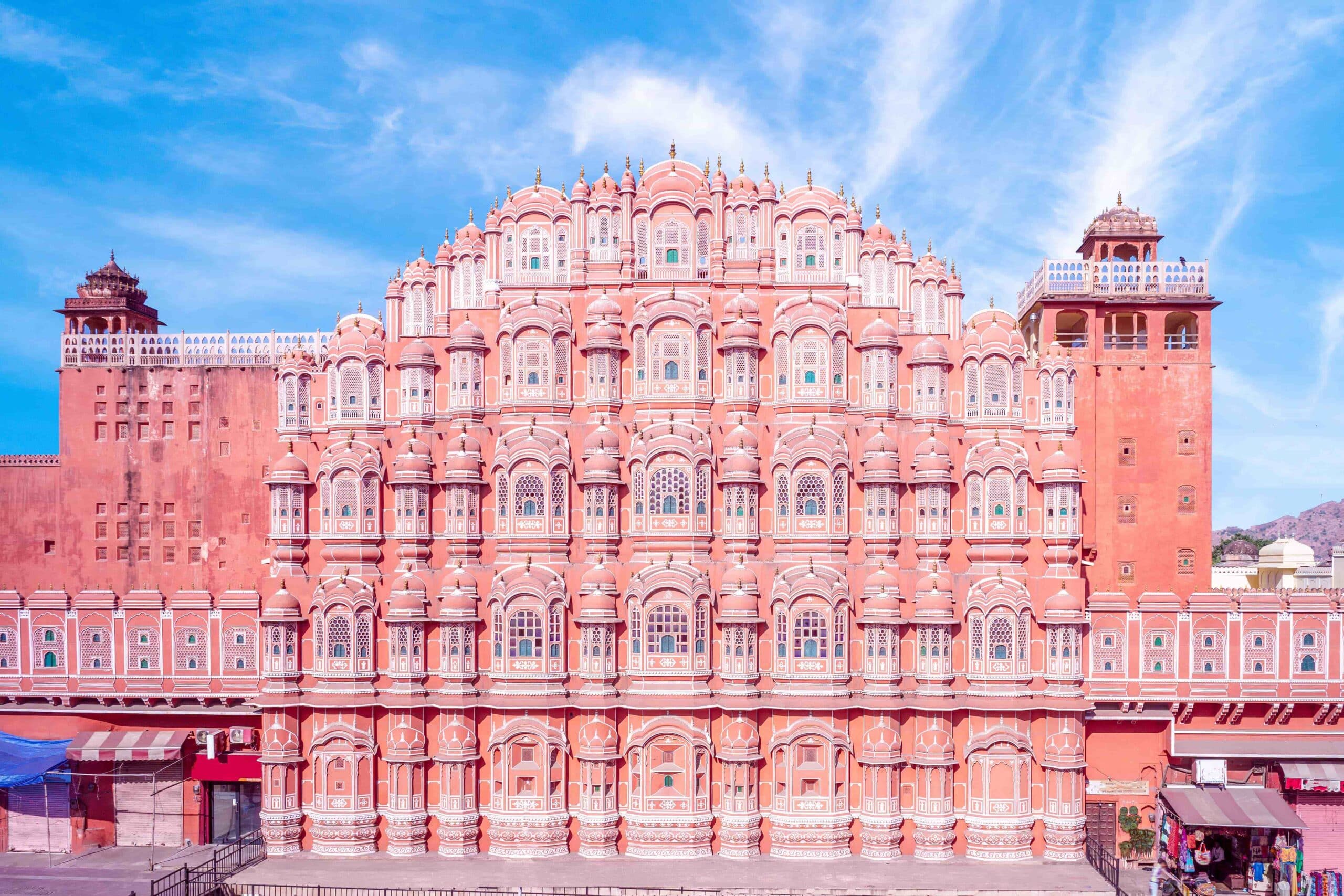
This can be seen in numerous historic Italian towns, but also in emblematic cases such as Jaipur, the famous Indian Pink City. Here, pink was adopted in 1876 to welcome the Prince of Wales, following a tradition that associated the colour with hospitality. That choice, initially conceived as a ceremonial gesture, gradually became part of the city’s identity, to the point that urban regulations still require the characteristic pink tones of its historic centre to be preserved.
The meaning of pink changed radically in the twentieth century. Contrary to what many people imagine, there was no single, established rule during the early decades of the century: pink and blue were associated with childhood and gender in different ways, sometimes even in opposite ways. Historian Jo B. Paoletti’s research shows not so much a simple, sudden “reversal”, but rather a long period of fluctuation, before the pink-for-girls and blue-for-boys code became firmly established, particularly from the middle of the century onwards. It was in fact during the post-war period that, through industrial production, department stores and increasingly child-focused marketing, the colour code became more rigid and took on the form we recognise today. Pink gradually ceased to be simply one shade among many and became a marker of gender.
This transformation is also clearly reflected in popular culture. In 1959, in Sleeping Beauty, Flora and Merryweather argue over the colour of Aurora’s dress: “Make it pink!”; “Make it blue!”. The dress constantly changes colour under the strokes of their magic wands, as though colour had already become an integral part of the princess’s identity. Rather than inventing a code, the scene illustrates how pink and blue had by then become immediately recognisable elements of the Western cultural imagination.
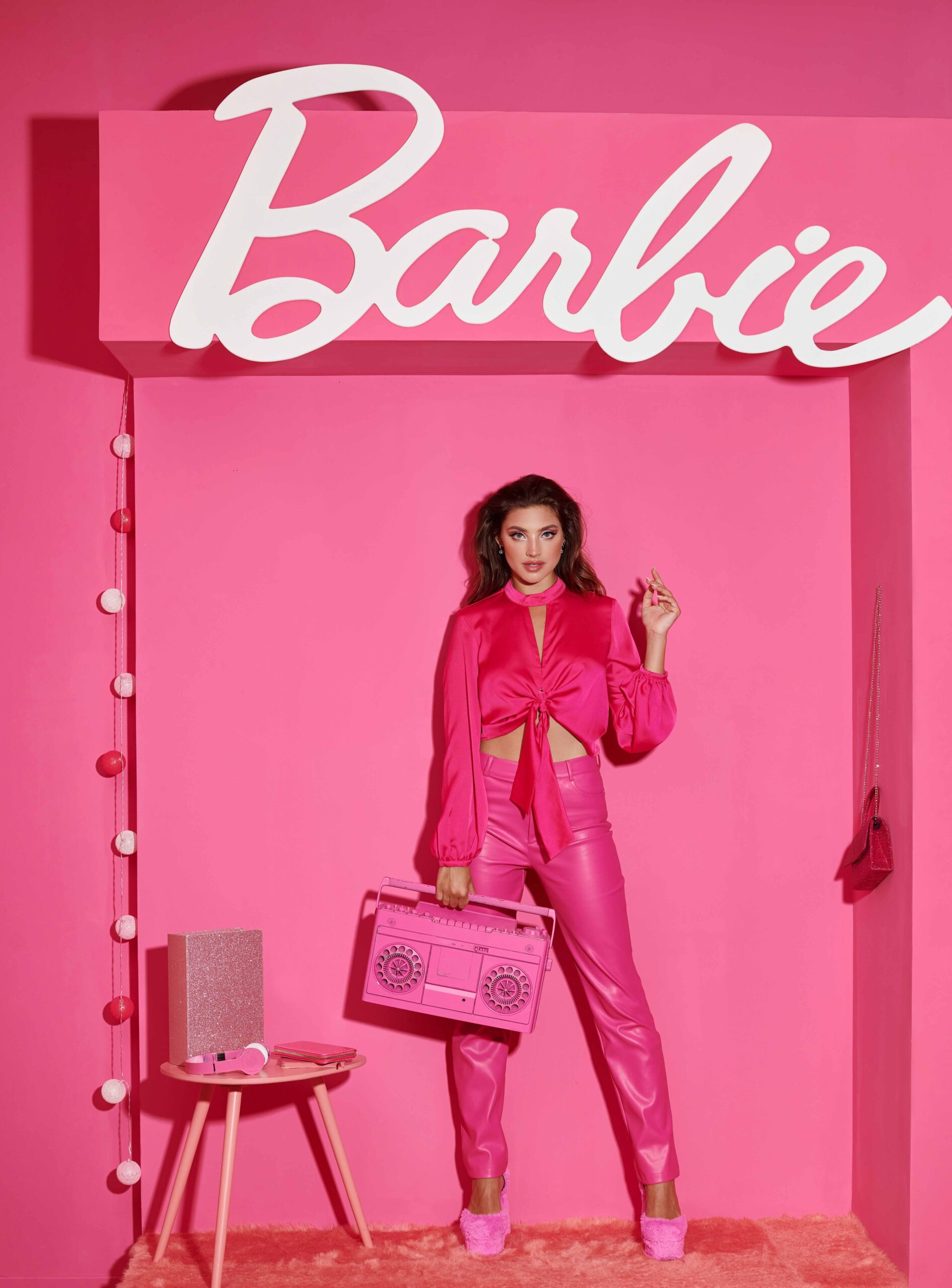
It is significant that Barbie was also created in the same year. The doll conceived by Ruth Handler did not simply choose pink, but built an entire universe around it: clothes, cars, accessories, furniture and, naturally, houses. Pink thus stopped describing matter and began to convey an identity, an aspiration and a lifestyle. Hello Kitty, created in 1974, would later reinforce this association; above all, however, Barbie transformed pink into one of the most powerful visual languages of contemporary popular culture.
At the same time as this cultural transformation was taking place, in much of the Western world the pinkish surfaces that had characterised cities and homes for centuries were gradually being replaced by new industrial materials, exposed concrete, neutral plaster and the aesthetics of white, grey and mineral tones. Pink did not disappear from homes, but it lost its role as a “natural” colour of the built environment, becoming increasingly a decorative choice and less and less a consequence of the material itself. For several decades, it thus experienced a kind of paradox: it was becoming increasingly associated with femininity precisely as it was ceasing to be one of the colours of our built environment.
This, however, is not the only story of pink in the twentieth century. While American popular culture was progressively transforming it into an identity code, European art continued to explore its material and perceptual qualities. In the early 1960s, Lucio Fontana created some of his most intense Concetti spaziali on pink canvases, demonstrating how the colour could still function as surface, light and depth, far removed from the stereotypes that were beginning to surround it in the collective imagination.
At the same time, a few architects took a different path. In Mexico, after all, pink had a history and meaning very different from those it was acquiring in Western culture. Its roots can be traced back to the pre-Hispanic tradition of natural dyes, including the intense red obtained from cochineal, but the expression Mexican Pink emerged in 1949. That year, fashion designer Ramón Valdiosera presented a collection at the Waldorf-Astoria in New York featuring an intense shade reminiscent of bougainvillea. When asked where the colour came from, he explained that it was everywhere in Mexican life, from toys to sweets, clothing and walls. A journalist then described it as “Mexican pink”, an expression that would subsequently become part of the country’s visual identity as rosa mexicano.
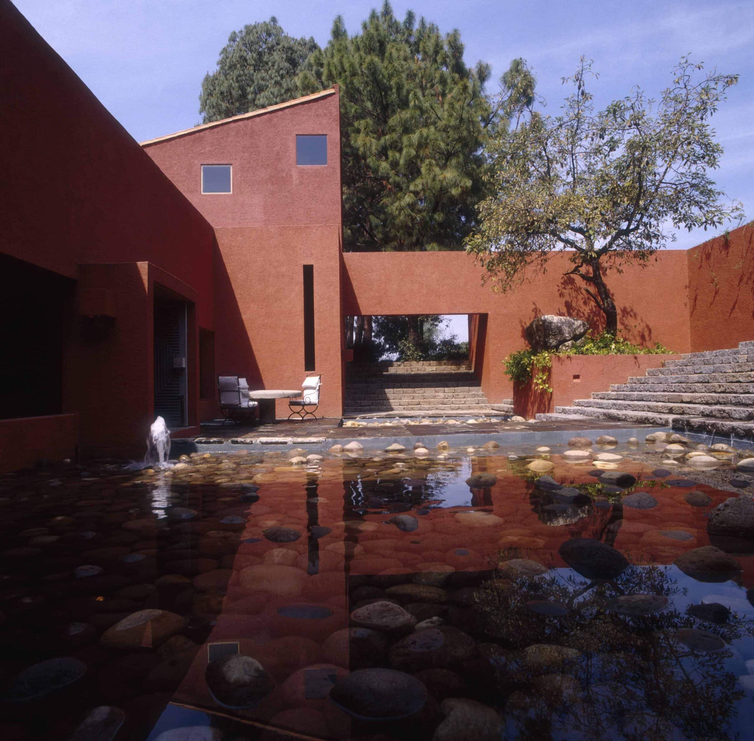
That pink thus became an expression of Mexican visual identity. Rufino Tamayo developed his own pictorial interpretation of it, now known as rosa Tamayo, while Luis Barragán and, later, Ricardo Legorreta turned it into a genuine architectural tool. Set against Mexico’s intense light, plastered surfaces and the essential volumes of modern architecture, pink does not simply cover buildings: it shapes their perception, models space and helps define their identity. It loses any reference to gender and becomes a tool for working with light, shadow and matter.
It is a legacy that LEGORRETA® continues to carry forward with remarkable precision: the studio uses two specific shades of pink, one intended for interiors and the other for exterior façades, calibrated according to the different qualities of light, materials and architectural scale. As Ricardo Legorreta himself explained in the final interviews collected in the volume El verdadero lujo está en el espacio (Arquine, 2012): “Color is not the essence of my architecture; it is a tool that I use in my own way. The essence of my work is in the spaces.” (“Colour is not the essence of my architecture; it is a tool that I use in my own way. The essence of my work lies in the spaces.”).

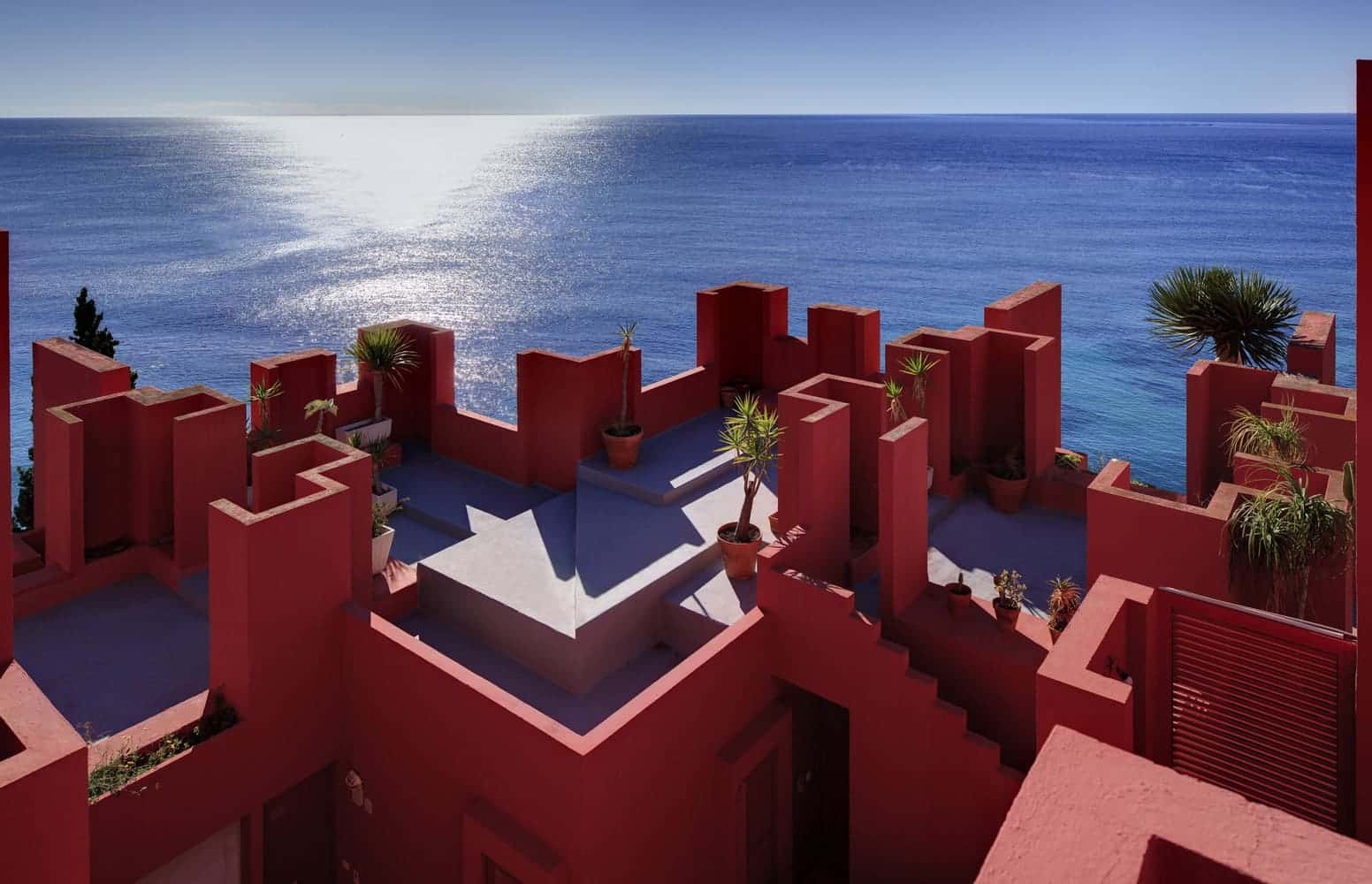
Outside Mexico, colour was meanwhile gaining a different kind of freedom. In 1973, Ricardo Bofill completed La Muralla Roja in Calpe, where an almost labyrinthine geometry is articulated through an entire range of colours, from reds to pinks, purples and blues. The pink surfaces, which have become among the most iconic images of the complex, show how colour can act independently of any reference to gender, transforming the perception of volumes, depth and light.
This idea of colour as a constitutive part of space also emerges in the perspective of Luca Bombassei, architect and collector: “I have always considered colour to be a material in its own right within architecture. With his Polychromie architecturale, Le Corbusier demonstrated very clearly how colour could alter the perception of a wall and therefore of space; with Barragán, it becomes light and atmosphere, while in Carlo Scarpa colour seems to belong to the material itself, to the plaster, the mosaic and the depth of a surface. In Bofill, it takes on a more monumental scale, ultimately changing the very perception of volumes. These are very different ways of demonstrating the same thing: colour does not come after the design; it is part of it.”

Perhaps this is the most surprising journey of pink. It begins with matter. It becomes urban identity. It transforms into a social symbol. Art preserves its complexity. Architecture returns it to light and matter.
Because colours do not have a fixed identity. Societies are the ones that give them meaning. And perhaps this is the lesson pink continues to offer us. Before becoming the colour of a doll, a brand or a gender, it was the colour of earth, lime and light. Materials change, fashions change, meanings change. Yet every time it returns, it reminds us that before colours tell us who we are, they tell the story of how we choose to inhabit the world.

Discover previous episodes: