
It is a question that only appears simple. All we have to do is look around us. Cars, smartphones, kitchens, buildings, offices, hotels, even the objects we consider most innovative increasingly seem to speak the language of white, black, grey, and neutral tones. Is it a coincidence? A trend? Or the reflection of a deeper cultural shift?

The title deliberately contains a double meaning. On the one hand, it refers to design explored through colour; on the other, it evokes the word colourless, suggesting a reflection on the progressive chromatic neutralisation that characterises many contemporary objects, buildings, and landscapes. This is not about deciding whether colour is better than grey—which is, of course, also a colour—nor whether neutrality represents an impoverishment of design. On the contrary, this column is founded on the belief that every colour choice expresses a precise idea of space, society, and, ultimately, our way of inhabiting the world.
In his celebrated essay Chromophobia (2000), David Batchelor described the distrust that Western culture has often shown towards colour, associating it with excess, irrationality, and the ability to disrupt order. White, grey, and neutral tones, by contrast, have progressively become symbols of purity, control, rationality, and elegance. But is this really the history of design? And above all: is colour merely an aesthetic choice, or is it one of its most powerful tools?
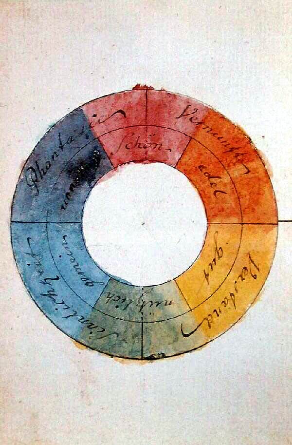
Wassily Kandinsky already wrote that “colour is a means of exerting a direct influence on the soul.” Today, neuroscience, environmental psychology, art history, and architectural studies seem to confirm that same intuition from different perspectives: colour changes our perception of space, directs our gaze, and constructs memory, identity, and well-being. It is not a surface treatment, but one of the essential components of design.
For this reason, Design IN-colore will not be a column about colours, but about the way we design, communicate, and inhabit the world through them. Because every colour choice is, before being an aesthetic choice, a cultural statement.

Each article will begin with a concrete story: a building, a material, an iconic object, a brand, a city, a work of art, a scientific study, or an episode from the history of design. Not to create a simple history of colours, but to read, through them, the evolution of architecture, design, and contemporary culture.
The column will move between history, philosophy, architecture, art, branding, neuroscience, materials, and innovation, because colour belongs to no single discipline: it runs through every form of design and often reveals its deepest intentions. Even when it seems to disappear.
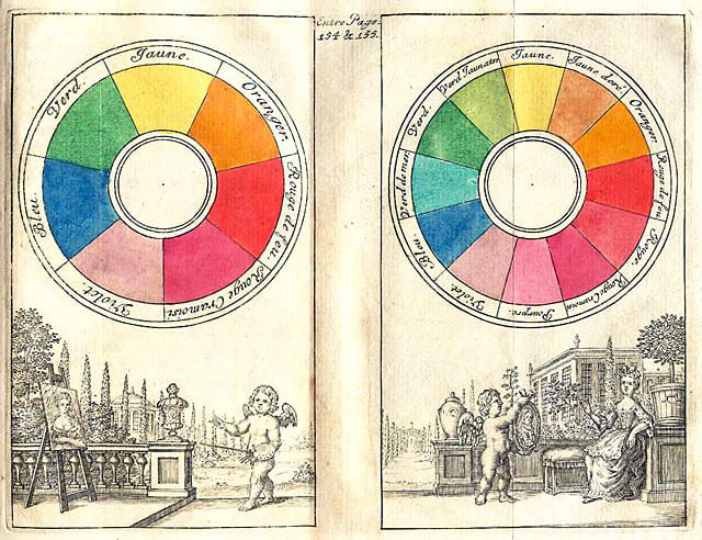
Ultimately, every era leaves a trace of itself through its colours. To tell the story of design means learning to recognise them, but also questioning what we think we know. Because some of the greatest misunderstandings in the history of art, architecture, and design have been born precisely from a colour.
We will begin with one of the most surprising of them all.